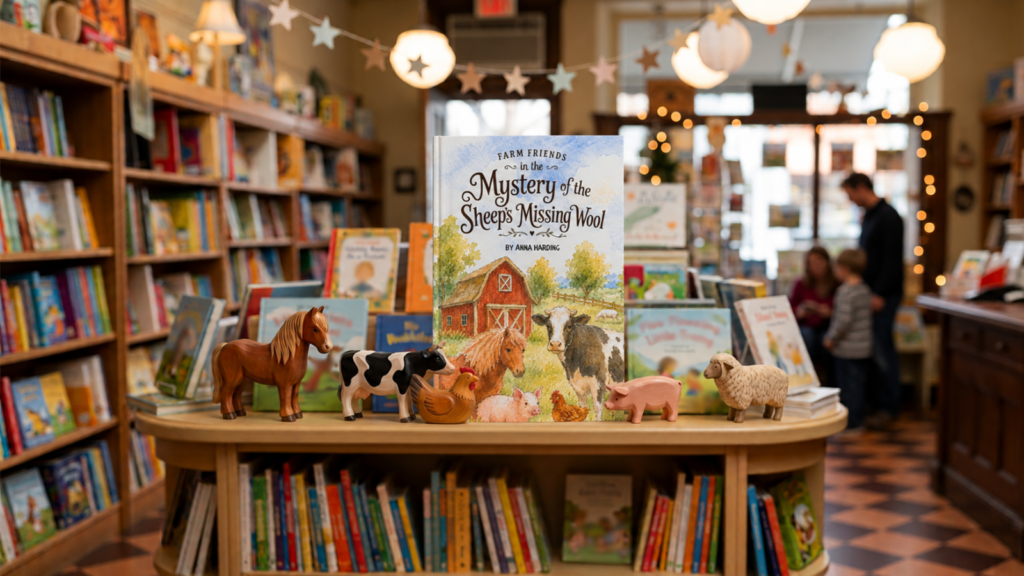
A successful book cover begins long before the first brushstroke reaches the paper. It starts with understanding the book, its intended readers and the feeling the author wants the finished design to convey.
For The Mystery of the Sheep’s Missing Wool, the design process moved through three distinct stages. Each stage allowed the ideas, artwork and practical requirements of the printed book to develop together.
stage one
Developing the Cover Concept

Every bespoke cover design begins with the client’s completed Style Guide Workbook followed by a consultation. Together, these provide the foundation for the project.
The workbook helps me understand the book’s subject, audience, tone and visual direction. It also records the client’s preferences regarding colour, typography, imagery and existing branding. Our consultation gives us an opportunity to explore those ideas in more detail and discuss any areas where the visual direction remains undecided.
A Time for Sketching
I then begin sketching. These first drawings are deliberately loose. Their purpose is to explore composition, character placement, scale, movement and the relationship between the illustration and the cover lettering.
For each project, I develop three alternative concept designs. These are presented alongside a project style guide containing suggested colours, typography and visual references. The client reviews the concepts and chooses the direction they would like me to develop.
This stage gives the client a meaningful choice without asking them to make design decisions from a blank page. It also creates a clear visual direction before detailed artwork begins.
Once the chosen concept has been approved, I refine the sketch and work through the individual elements. For The Mystery of the Sheep’s Missing Wool, this included developing the farm setting, arranging the animals and ensuring the newly shorn sheep appeared at the correct scale within the background. The humour of the story needed to appear within the illustration without overwhelming the warmth of the overall scene.
Colour
I also establish the project colour palette during this stage. Colour choices influence far more than appearance. They help set the mood, guide the viewer’s eye and ensure every element feels part of the same visual world.
When a cover involves watercolour, I often begin testing pigments and colour combinations while refining the drawing. Small painted studies reveal how colours blend, dry and sit beside one another. A colour which looks suitable on a digital screen sometimes behaves quite differently on watercolour paper.
By the end of this stage, the cover has a clear structure, visual identity and colour direction. The finished artwork has not yet been created but the design already has a strong foundation.
stage two
Creating the Artwork
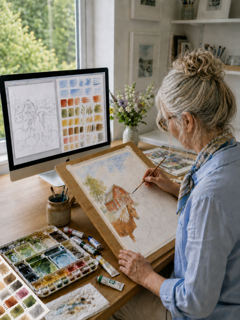
This is the stage where the selected concept begins to take physical or digital form.
The artwork might be created digitally, through traditional painting or through a combination of several techniques. The chosen method depends on the subject, audience and atmosphere of the book.
Styles
For a series of horror covers, I created the main illustrations as vector artwork. I then applied distressed and textured overlays to soften the clean digital edges and introduce a worn, unsettling quality. The finished designs retained the control and clarity of vector illustration while gaining the aged surface texture suited to the stories.
For a branding guide cover, I used a mixed-media approach. Hand-painted elements sat alongside metallic details and the client’s own photography. Combining these materials produced a layered result which would have been difficult to achieve through one technique alone. The challenge lay in bringing each element together so the finished cover still felt balanced and unified.
The Mystery of the Sheep’s Missing Wool required a softer and more traditional approach. Watercolour suited the gentle humour of the story and the rural setting. It also gave the farm animals warmth and personality without making the illustration feel overly polished or rigid.
The composition had already been established during the concept stage, including the areas reserved for the title and author’s name. This meant I was not painting an isolated picture and attempting to fit lettering over it later. The illustration and typography were planned as parts of one cover.
The Fun Begins!
I began with light washes to establish the main areas of colour. Working gradually allowed the white of the paper to remain visible in selected areas, helping the scene retain the brightness associated with traditional watercolour.
The landscape, barn and distant details needed softer edges so they would sit naturally behind the main characters. The foreground animals required stronger definition, richer colour and carefully placed shadows. This created a sense of depth without introducing heavy outlines.
Watercolour involves a balance between control and natural variation. Pigment gathers differently across the paper depending on the amount of water, the texture of the surface and the drying time. Those slight changes form part of the appeal. My role is to guide them while preserving the movement and character of the paint.
Individual details were built in layers. Each wash needed time to dry before further colour was applied. Applying the next layer too early would cause unwanted bleeding. Waiting too long or using too little water would produce harder edges. Both effects have a place within an illustration but they need to support the design rather than distract from it.
Setting the Scene
The animals also needed to feel as though they belonged within the same scene. Consistent colour temperature, shadow direction and painting style helped connect them. Their positions and expressions supported the story, particularly the slim, newly shorn sheep placed near the fence line in the distance. I regularly reviewed the artwork at its intended cover size throughout the process. Details which look clear on a large sheet of paper sometimes disappear when reduced. Other details become too dominant. Checking the artwork at print size helps maintain the correct visual hierarchy.
Traditional artwork always contains a degree of unpredictability. A wash might dry with a stronger edge than expected or a colour might settle differently across the paper. Some of these results add life to the image. Others are corrected during painting or addressed during the digital editing stage.
The goal is not to remove every natural variation. The goal is to retain the qualities which make the artwork feel hand-painted while ensuring the illustration works as a professional book cover.
Stage three
Digital Editing and Print Preparation
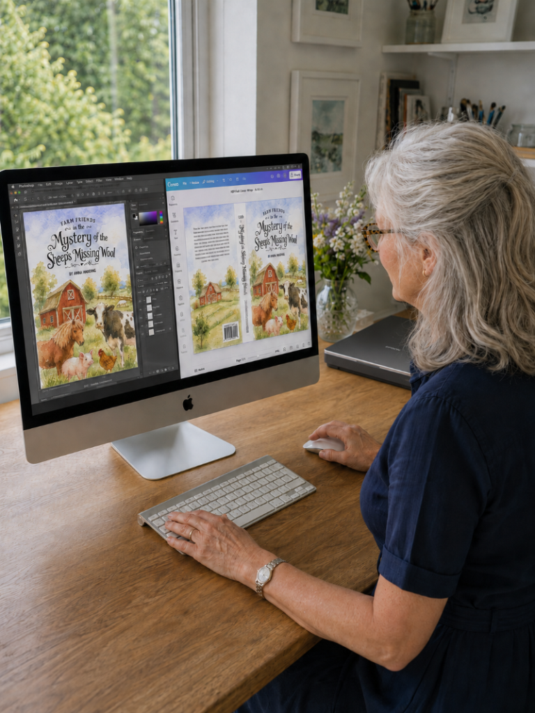
Once the artwork is complete, I scan it at a high resolution suitable for professional printing. Scanning preserves far more detail than photographing the artwork. It records the grain of the paper, the transparency of the washes and the subtle changes between layers of pigment. The original painting then becomes the starting point for the final digital cover.
I review the scanned artwork carefully and remove dust, unwanted marks and scanning imperfections. I adjust colour, contrast and tonal balance so the digital version reflects the original painting as closely as possible. Printed colour and screen colour behave differently. A screen produces colour through light while printed colour depends on ink, paper and the printing process. Careful adjustment helps prevent pale washes from disappearing or darker colours from becoming muddy during printing.
The scanned artwork also gives me greater control over the final composition. I reposition or resize individual elements where necessary, refine edges and make small corrections without losing the character of the original painting. I preserve the watercolour texture rather than smoothing the image until it looks digital.
Typography
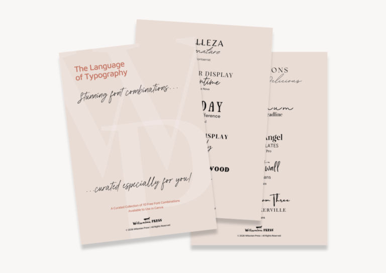
Typography is then finalised and placed within the composition. I check the title at thumbnail size as many readers will first see the book as a small online image. The lettering must remain clear while still feeling connected to the illustration.
Front Cover, Spine and Back Cover
The front cover design is completed before the book’s final page count is known. The full printed cover cannot be sized precisely until this information becomes available. A printed paperback or hardback cover usually uses a wraparound cover template. This is one continuous document containing the back cover, spine and front cover. It also includes the bleed and safe areas required by the chosen publishing or printing platform. The spine width depends on the final page count, paper type and platform specifications. A book with 80 pages needs a narrower spine than a book with 280 pages. Even a small change in page count affects the total width of the cover file.
For this reason, the visual design will be complete but the final dimensions remain adjustable. Once the client confirms the final page count, trim size, paper choice and publishing platform, I place the design onto the correct wraparound template and adjust it to fit the book precisely. During this final stage, I check the spine alignment, bleed, trim edges, safe margins and barcode area. I also review the back cover text and ensure important elements sit safely inside the trimming boundaries.
Deliverables
The client receives a print-ready PDF along with an editable Canva version. A direct link to the Canva document allows the client to access the cover and make permitted future updates, such as changing back cover wording, adding review quotes or preparing a revised edition.
Every book presents a different combination of creative and technical decisions. Bringing the illustration, typography and print requirements together from the beginning produces a cover which feels connected to the story rather than added after the book has been written.
For The Mystery of the Sheep’s Missing Wool, the finished cover grew from a rough pencil concept into a hand-painted farm scene and finally into a professionally prepared wraparound design. Each stage served a purpose and each decision helped the cover move closer to the book it was created to represent.