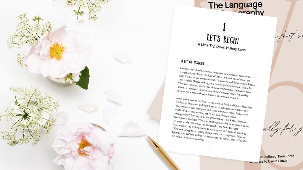
As a designer deeply invested in crafting memorable book interiors. My journey often starts with a fundamental aspect of design – typography. In the realm of printed books, unlike their digital counterparts, there’s a unique opportunity to employ design magic through the strategic use of fonts. The selection of the right font combination is not just a matter of aesthetics but also functionality. Font contribute significantly to the readability and overall appeal of a book. In this post, we’ll cover the basics and reveal our top 10 Canva font combinations.
Understanding the Basics: Types of Fonts
Before diving into my top Canva font combinations, let’s clarify the three primary types of fonts:
- Serif Fonts: Recognisable by the small lines or strokes regularly attached to the end of a larger stroke in a letter or symbol. Serif fonts like Times New Roman or Garamond are often associated with tradition and reliability, making them a favourite for body text in printed books for readability.
- Sans Serif Fonts: As the name implies, ‘sans’ (French for ‘without’) serif fonts do not have the small projecting features at the ends of strokes. Fonts like Helvetica and Arial embody a modern and clean look. Suitable for subheadings or any content where a straightforward, contemporary style is desired.
- Script and Display Fonts: These fonts include a variety of styles, from formal scripts that mimic calligraphy to bold display fonts designed for impact. They are perfect for titles, chapter headings or any element where you want to add character or draw attention.
Canva Font Combinations: Our Top Ten
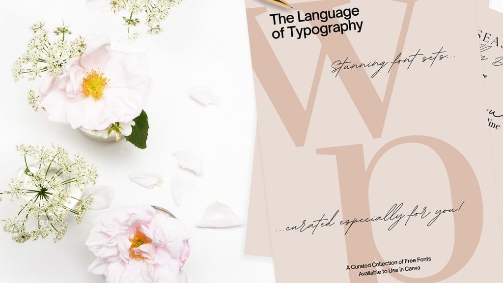
Each of these Canva combinations comprise of a Display or Script font, a Serif font and a Sans Serif font; though there may be one or two where both Display and Script appear in the same combination. The fonts are all available with the free version of Canva.
Tips and Tricks for Using Canva Fonts Effectively
- Contrast is Key: Always aim for a good contrast between your chosen fonts, especially between headers and body text, to enhance readability and aesthetic appeal.
- Limit the Number of Fonts: Too many fonts can create a chaotic look. Stick to 2-3 fonts per design to maintain harmony.
- Consider the Mood: Each font carries its own personality and emotional weight. Choose fonts that reflect the tone and theme of your book.
- Practicality Comes First: While it’s tempting to choose overly decorative fonts, readability should always be your top priority, especially for body text.
The Dos and Don’ts of Canva Font Pairing
- Do: Ensure there’s enough contrast in font sizes, weight, and style.
- Don’t: Use fonts that are too similar to each other; they can be hard to differentiate and could confuse the reader.
- Do: Test print your fonts. Some fonts look great on a screen but lose clarity in print.
- Don’t: Overlook the importance of proper kerning and spacing. Even the best font can be ruined by poor spacing.
Effective typography is a powerful tool in book design, capable of not only conveying the essence of your text but also enhancing the reader’s experience. By carefully selecting and pairing fonts, you can transform the interior of a printed book into a coherent and inviting piece of art.
Remember, the right font combinaiton not only communicates the content effectively but also injects personality and style into the pages of your book, making each turn of the page a delight. Happy designing!
We’ve got you covered!




Leave a Reply